A guide for those who like to dig deeper
973 records, 2,125 sources, 90 years of history. Where to click, and how to read the marks, the bands, the arcs and the hatching.
Most “AI timelines” on the web look alike: ChatGPT, AlphaGo, Deep Blue, a little Turing for respectability. The AI Evolution Atlas is built differently. I call it “an argued dataset of what the present grew out of”: I take a modern technology and walk back from it to the work that made it possible. That is why it holds Homer Dudley, who in 1936 took a human voice apart and put it back together in front of a hall, and in 1939 described it as “a buzz and a hiss”, and Taras Vintsyuk, who in 1968 recognised speech by dynamic programming in the Kyiv journal Kibernetika.
Below I walk through the atlas section by section.
1. The front page: five numbers, one band and four windows into the past
Where: aitimeline.dev/en/
At the top, five counters: 973 records · 728 people · 429 organizations · 323 systems · 2,125 sources. The label under each number is a link: “records” opens the timeline, “people”, “organizations” and “systems” lead to the indexes, “sources” to the sources page.
What opens from the front page in one click: the timeline (from the counter, from the years under the band, from the thumbnails and from the footer), the indexes of people, organizations and systems, the sources page, each of the ten recently added records, the “On this day” record, and from the footer “Lines”, “Relations graph”, “Methodology” and “The 6-in-1’s blog”. The “All records” page is two clicks away: its link sits under the axis, in the “Site sections” tab and on the graph page.
Under the counters stands a coloured band, “The shape of the collection”. It deserves a careful look.

The legend of the band
The band is five coloured layers, one per topic:
| Layer (bottom up) | Topic | Colour | Mark on the axis |
|---|---|---|---|
| 1 | Foundations | purple | ● circle |
| 2 | Language | green | ■ square |
| 3 | Images | crimson | ▲ triangle pointing up |
| 4 | Robotics and autonomy | blue | ▼ triangle pointing down |
| 5 | Multimodal | orange | ◆ diamond |
The band is easy to misread, so three cautions:
- A layer’s height is a share, not a count. In every decade the layers add up to 100%. That is why the whole band is the same height, although the 1930s hold 2 records and the 2020s 442. I did this on purpose. Once there were bars with counts here, and the current year flattened the rest of history into a line. With 171 records in 2026 already, bars would work even less.
- The layer edges are straight, not smooth. Each decade is one measured point and the points are joined by straight lines. A smoothed curve would show values the collection does not have.
- It is the shape of the collection, not of AI history. “Foundations” here is the name of one of the atlas’s five topics, not a judgement. After the two records of the 1930s the collection is mostly that topic: in the 1940s it holds 14 records of 15 (93%), in the 1950s 30 of 38 (79%). Then the collection spreads out over five directions, and in the 2020s “Foundations” is 206 records of 442 (47%). How much AI there “really was”, the band does not say.
The years under the band are links too: each decade opens the axis right on it. The left edge reads 1936, not 1930, because that is the year of the earliest record. So the first decade on the site is 1936–1939.
A curious detail: the collection’s earliest record, Dudley’s demonstration of 11 September 1936, is multimodal, not foundations. Speech has no topic of its own. Five shapes are the limit of what an 11-pixel mark can tell apart, so speech lives inside multimodal. Hence the orange left edge of the band: both records of the 1930s are Dudley (the 1936 demonstration and the 1939 paper), and in the 1940s one sound spectrograph out of 15 records stays orange, the rest are foundations.
Thumbnails of the axis and “Recently added”
Below stand four thumbnails of the timeline, drawn from the same records as the axis itself:
- the whole axis, 1936 — 2026, 973 records;
- 1970–1979 by year, 53 records;
- 2022 by month, 43 records;
- August 2026 by day, 23 records.
Each opens the axis on exactly that period. So the atlas can be seen at four scales before the first click.
Lower still is the “Recently added” row: the ten records that entered the atlas last. These are new records in the collection, not new events. A program that measured ECGs by itself in 1962 may stand next to Dudley’s 1936 demonstration and World Labs of 2024. The row scrolls sideways, and in current browsers there are round arrows beside the heading as well. Whoever comes back to the atlas starts here, to see what is new.
Under it is the “On this day in AI history” card: a record that happened on this calendar day in another year, or, failing that, the nearest one.
At the very bottom of the front page are the site’s sections: “Open the timeline”, “Lines”, “Relations graph”, “Methodology”, “The 6-in-1’s blog”, and beside them links to the Telegram channel «ШІ: календар» and to the licence.
2. The timeline: the main section
Where: aitimeline.dev/en/timeline/
The first time, click “How to use” at the bottom of the screen. The tour walks from a decade to a year, a month and a day, shows the lines on the axis and opens a record card. It takes a minute.
How the axis lays out time
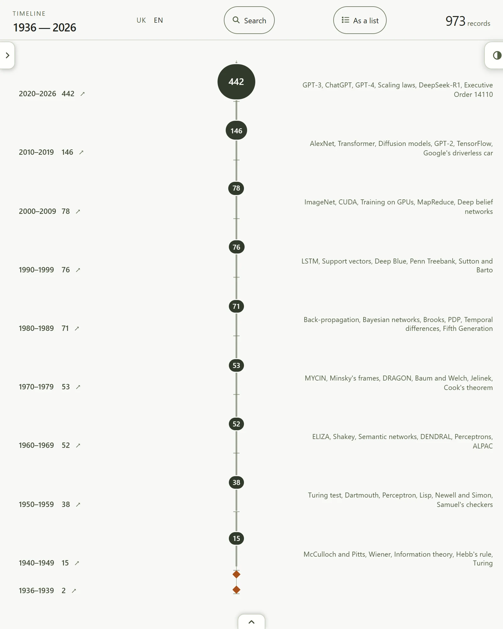
On a wide screen (900 px and up) the axis is horizontal and time runs left to right. On a narrower screen, mobile devices among them, the axis is vertical and the newest is at the top: you open the atlas and see the 2020s at once, and scroll down to 1939. At first everything is in view: ten ranges from 1936 to 2026, eight whole decades and two partial ones at the ends. How many records each holds is on the screenshot.
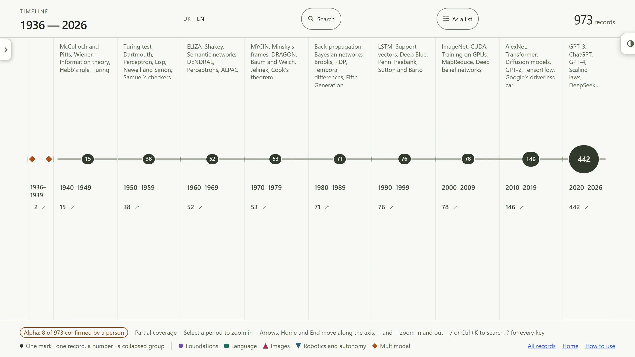
Click a decade and the axis lays it out by year. Then by month, then by day. The ← button at the top left, before the period’s name (it is called “Zoom out”), goes one level up; on the keyboard − does the same and + zooms in. “All time” brings the whole axis back at once.
The “Site sections” tab
At the left edge, just under the heading “Timeline 1936 — 2026”, a small tab with an arrow sticks out. It is the “Site sections” tab. A click slides out a panel on the left: “Home · AI Evolution Atlas”, “All records”, “Lines”, “Relations graph”, “Methodology”, “The 6-in-1’s blog”. Whoever landed on the axis straight from a search engine finds the rest of the atlas here. On mobile devices the tab is in the same place.
On mobile devices, where the axis is vertical, the block under the axis also folds into a bookmark with an arrow at the bottom centre of the screen, “Status and links under the axis”. The block holds the alpha badge, the “Partial coverage” note, the topic legend and the links “All records”, “Home”, “How to use”. The axis gets the whole screen this way, and the block slides out when it is needed.
The legend of the axis: what is drawn here
The band on the front page shows the collection as a whole. The axis has signs of its own, and each means something. A short legend sits under the axis, the full one (“How to read the axis”) is on the Methodology page.
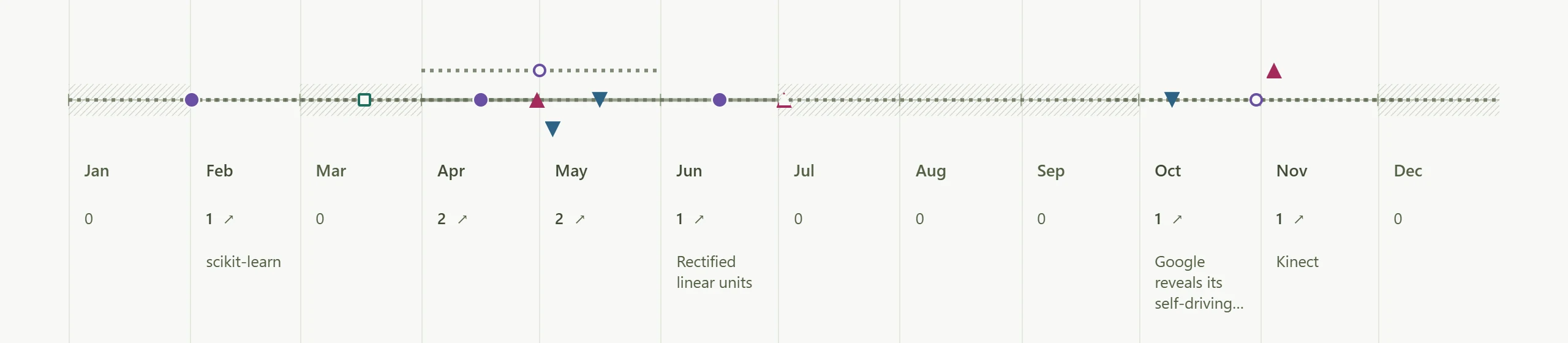
- A coloured shape is one record. Colour and shape carry the topic together (the table above), so the axis reads without colour too: in black and white, and for people who see colours differently.
- A bubble with a number is a collapsed group. When a span holds too many records they merge into one mark, and the larger the number, the larger the bubble. A click opens the list of those records.
- A blue bubble means every record in the group is from the current year, 2026. That year is still being written and is set apart.
- A solid band along the axis means the record occupies a span, not a moment. A date known to the month or the year, or an event that lasted several days, stretches over its whole span, and the mark stands in the middle of it.
- A dashed band with a hollow mark (an outline only) means the record is dated more broadly than the period the axis is showing. Only the year is known, say, and the axis shows months. The mark stands in the middle of the span, but no period under it counts this record, so a 0 may stand nearby. The “No finer date: N” button at the bottom gathers such records.
- Diagonal hatching means the collection holds nothing for this period. I stress this: it is a claim about the collection, not about history. Hatching does not mean nothing happened then, and a “Nearest record: …” button appears beside the empty period.
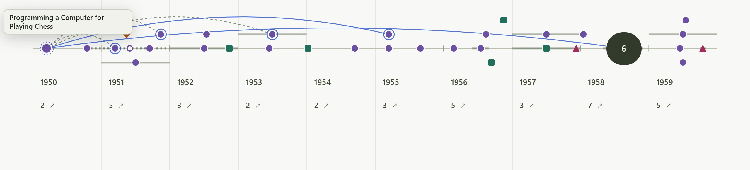
- Arcs over the axis appear when the pointer or the keyboard focus rests on a mark. They lead to related records. A solid arc is a relation the sources confirm (“Builds on”, “Extends”, “Enables”). A dashed arc is a relation by topic (“Related”) or a contrast, with no claim that one record caused the other. On a touch screen the arcs show from the mark you touched as soon as you return to the axis.
- Rings: a fine dotted ring marks the record the arcs start from, and a solid ring stands on every record at the other end of an arc.
- Small captions over the decades (“McCulloch and Pitts, Wiener, Information theory…”) show at full range only. Each such word is tied to a real record in the collection, so they cannot advertise what is absent.
- The number by a period says how many records it holds, zero included. If there is one record and the period is wide enough, its name stands right under the number, nothing to hover over. The mark itself also names a single record when the pointer rests on it. In a narrow period with several records, point at the period itself and their names appear, up to six.
Axis or list
The “As a list” button at the top switches the same records to reading: by decade, with date, topic and source. “On the axis” brings the drawing back.
The record card
A click on a shape opens a card right over the axis. The card holds: the date, as precise as the source allows, the event type, the topic and the lines, the title, a short summary, the related records, and at the bottom the verification badge and the number of sources. The “Why it matters” section, the full text and the sources themselves are not on the card: they are on the record page. A few more things are easy to miss:
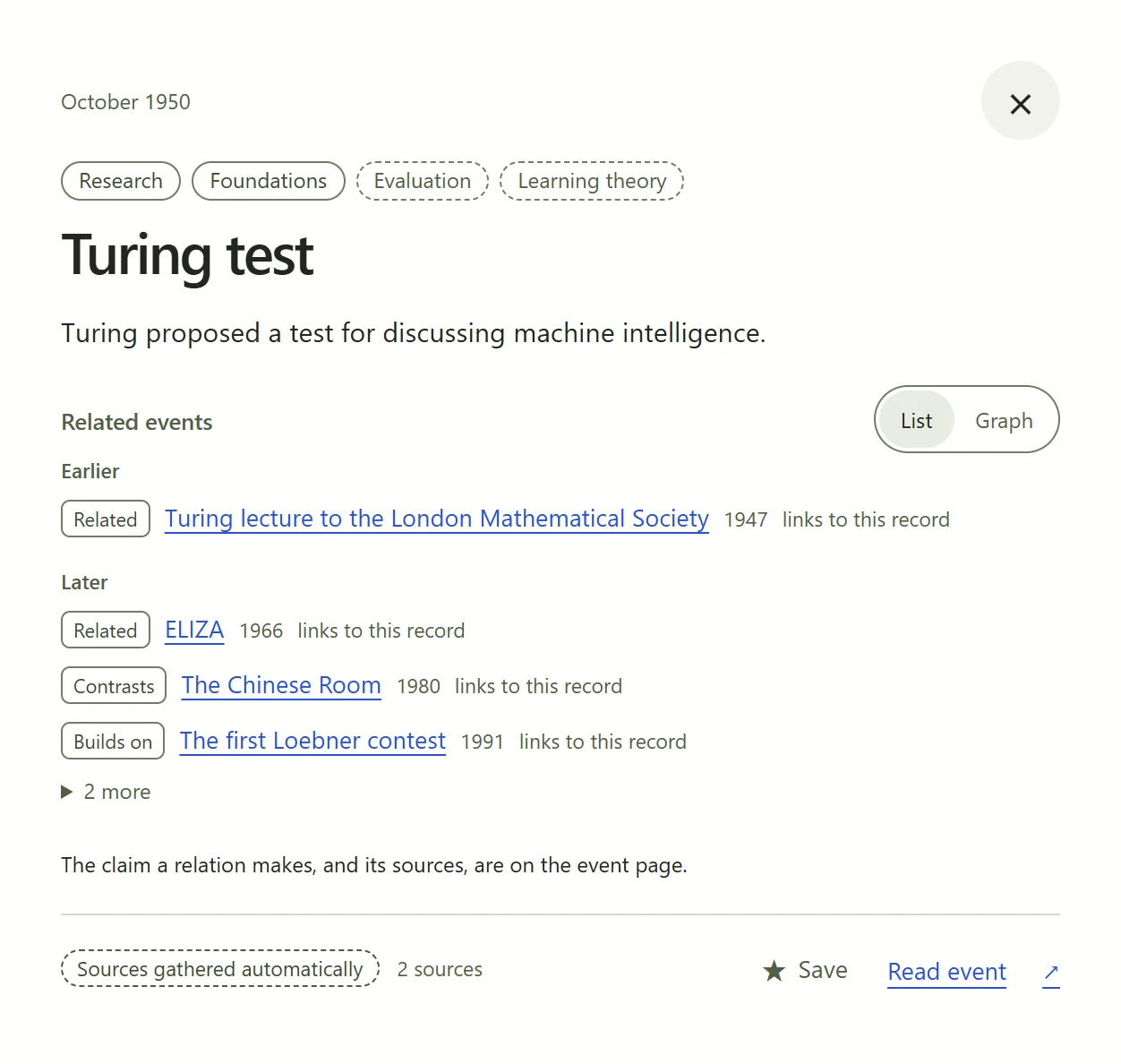
- ★ “Save” at the bottom of the card, next to “Read event”, puts the record aside. As soon as you have saved something, a ★ button with the count appears at the top between “Search” and “As a list”. A click on it shows the saved records as a list, and another brings the previous view back. Switch that list to “On the axis” and the saved records light up while the rest dim. Everything is kept in your browser only.
- Relations in time. Related records are laid out as “Earlier”, “Same period” and “Later”, and it is visible which of them link to this record. The collection holds 1,330 relations in all.
- List / Graph. The switch shows the neighbours one step out as a small graph. A click on a neighbour opens its own neighbours, and so a chain of influence can be followed back to the 1940s.
- “Read event ↗” leads to the record’s full page.
3. Search: what is found lights up on the axis
How to open: / or Ctrl+K from any page.
Search works on titles, summaries, the names of people, organizations and models. Three characters at least. There are no filters on purpose: type organizations and people as text.
The interesting part happens on the axis itself. What is found lights up, the rest dims but does not disappear, because a record stays where it stands in time. Under the field you see, say, “12 of 973 records · 3 here”. The “12 as a list →” button opens the axis wide enough to hold every match and shows them as a list.
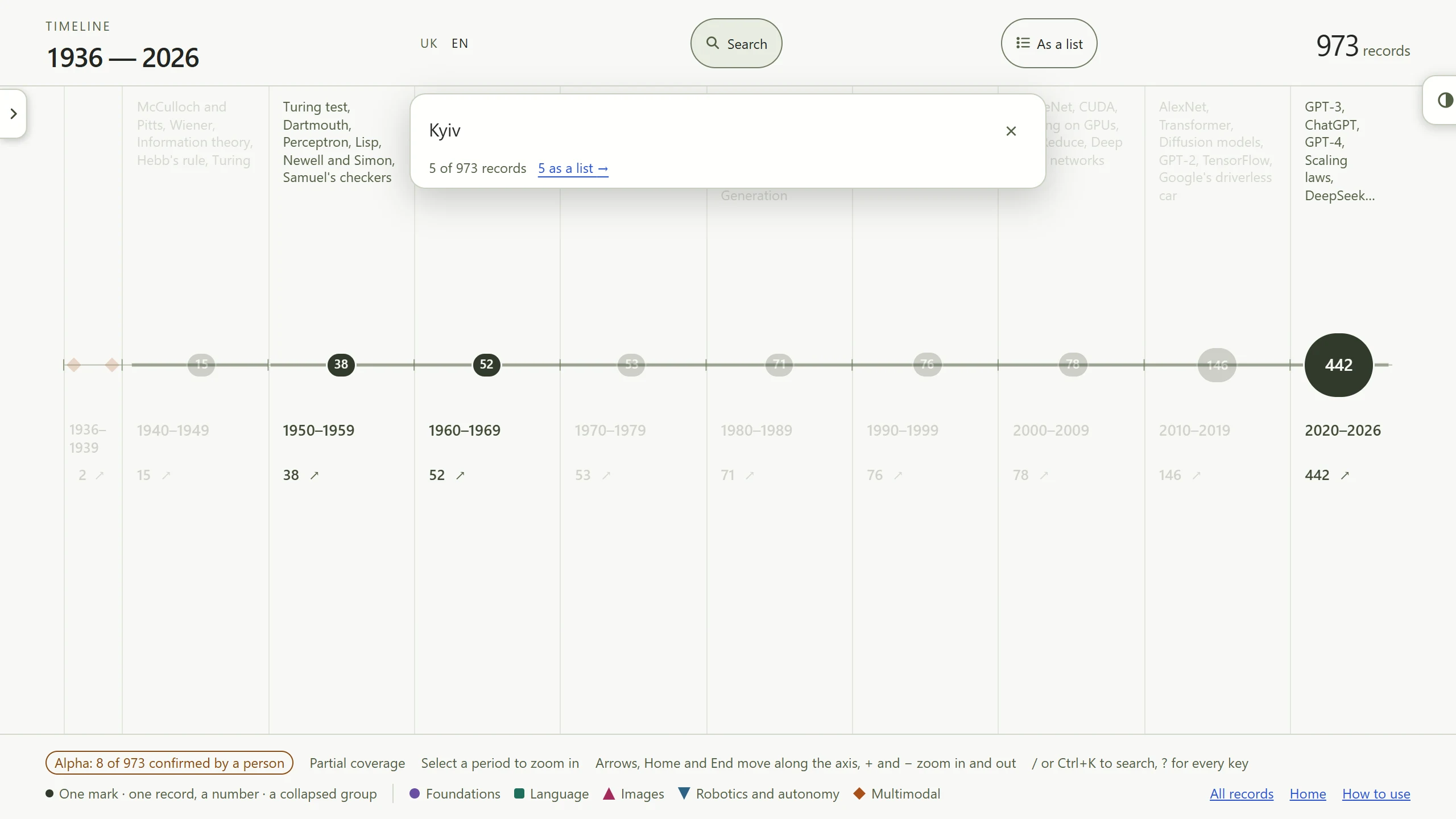
Two more things about search:
- It understands Ukrainian cases. It has a Ukrainian stemmer built in, a program that reduces a word’s forms to a common stem, so «мовленням», «мовлення» and «мовленні» are found together. English is searched by word beginnings, which covers most of its inflection.
- It remembers your queries (“Recent”), in your browser only. The “Forget” button clears them.
To warm up, try: Kyiv, Glushkov, Ivakhnenko, Bell Labs, perceptron, court.
4. The relations graph: the whole collection in three dimensions
Where: aitimeline.dev/en/graph/, or the “Site sections” tab on the axis.
The axis lays the records out in time, the graph in their relations. Every record is a node here, every relation a line. A node’s colour and shape are its topic, as on the axis, and its size is how many relations the record has.
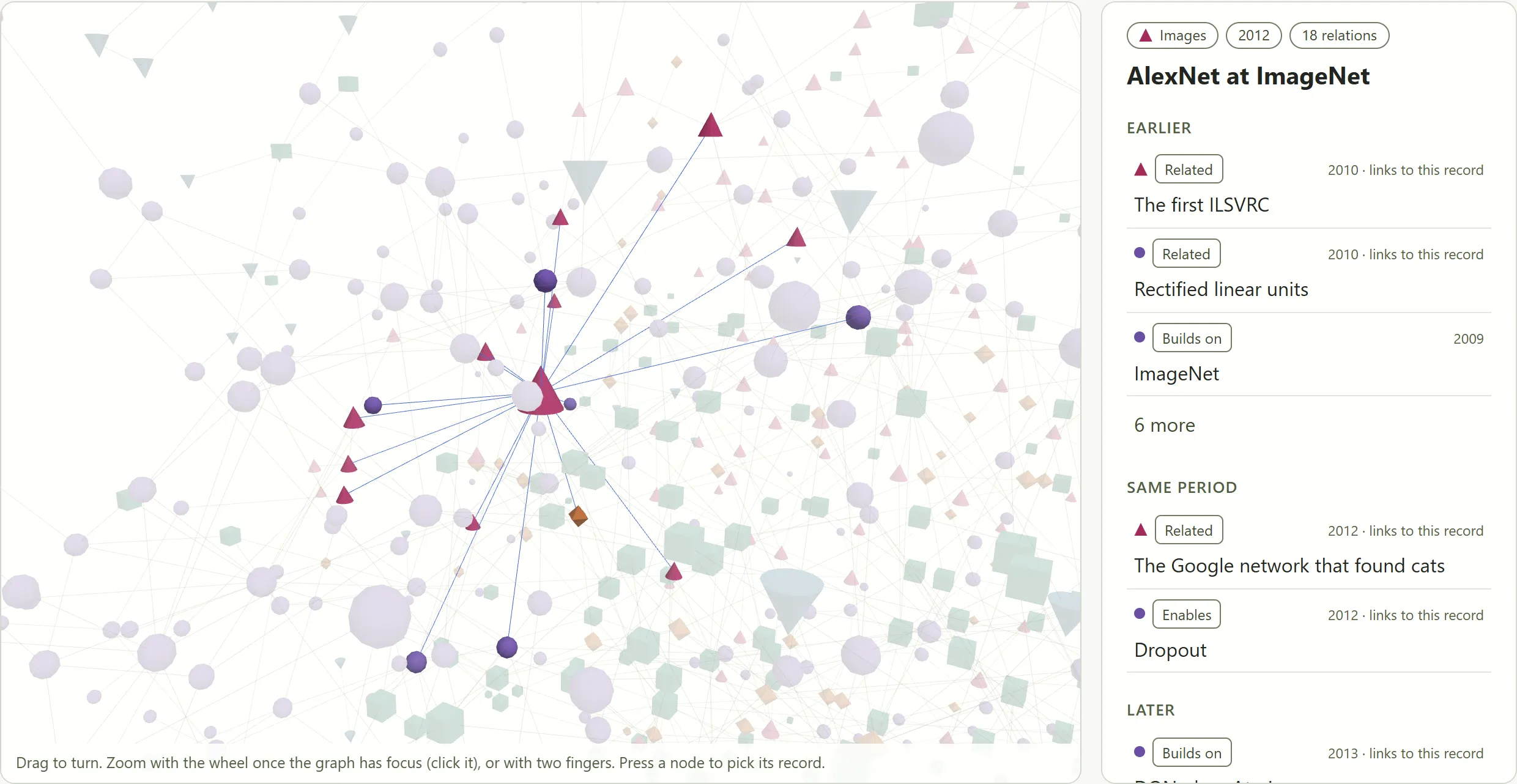
The graph shows what the axis cannot. Between 973 records there are 1,330 relations, and the collection falls into 62 separate groups: within a group you can walk from record to record along relations, between groups there is no path. The largest group holds 836 records (86%); it is the “mainland” of AI history. The record with the most relations in it is AlexNet at ImageNet (2012, 18 relations): threads run back from it to the neocognitron, LeNet and CUDA, and forward to ResNet, DQN and WaveNet.
The rest is 37 smaller groups, chains and islands around the mainland, and 24 records with no relation at all. Each island tells a story of its own. The largest (12 records) is robots that learn: from the PR2 that folded a towel fifty times in a row in 2010, through grasping learnt on synthetic data, to a hand that solves a Rubik’s cube and the four-legged ANYmal trained in simulation. An island of 9 records holds classical computer vision and navigation: the Kalman filter, optical flow, SLAM. Another, of 6, is early computer vision: from a photograph in a computer’s memory in 1957 and the summer vision project of 1966 to Marr. Then two islands of five records each. One is about algorithmic fairness in medicine and justice. The other is about state supercomputers: from the fastest machine in the world without a single accelerator, through a supercomputer shared by ten European countries and 4,480 Hopper accelerators in Barcelona, to India buying accelerators as a public service. Among the 24 records with no relation are Microsoft’s Tay and Bing’s “Sydney”. For every such island the honest question is: was there no relation, or has it not been found yet?
How to move here:
- drag the graph to turn it, zoom with the wheel (when the graph has focus) or with two fingers;
- a click on a node opens “Selected record” in the panel beside it: topic, year, number of relations, title, the neighbours laid out as “Earlier”, “Same period” and “Later” with each relation’s type (“Builds on”, “Enables”, “Related”), and under them the buttons “Record page”, “On the timeline” and “Clear selection”. The neighbour buttons lead on through the graph, by mouse and by keyboard alike;
- under the graph is the list “Groups of connected records”. The five largest groups are in view; the other groups and the records with no relation lie under one fold (“Show 34 more groups”). For each group there is its makeup by topic, a line “Most relations” with the name of the record that has the most, and the group’s records by year. The eye button beside that line (“Show in the graph”) selects that record in the graph;
- the selected record goes into the address (for instance
/en/graph/#evt-0007for AlexNet), so a link can share exactly this selection; - keys: the arrows turn the graph,
+/−zoom,Escclears the selection,Homebrings back the starting view.
The graph is drawn with WebGL, the browser’s technology for three-dimensional graphics. If a browser does not support it, an explanation stands in place of the drawing: “This browser does not draw WebGL, so the graph cannot be shown. The panel beside it and the groups below work without it.” The “Selected record” panel then works exactly as it does with the drawing: a record is selected with the eye button beside a group, the panel shows its topic, year, number of relations and neighbours, and the neighbour buttons lead on. The list of groups under the graph stays in place too.
5. Keys for those who dislike the mouse
| Key | Action |
|---|---|
/ · Ctrl+K · ⌘K |
search |
? |
the list of every key |
Esc |
close the search, a card or the list |
← → ↑ ↓ |
from mark to mark (on the graph: turn) |
Home · End |
the first or the last mark (on the graph Home: starting view) |
Enter |
open a mark or a period |
+ · − |
zoom in and out |
T |
light or dark theme |
Ctrl+K works on the Ukrainian keyboard layout too, because the site listens for the physical key, not the letter.
6. An address you can share
Everything you see on the axis is written into the page’s address, so a link carries the exact state:
?time=1990sopens the axis on the 1990s. A year works too, say?time=1997, or a month, like?time=1997-06.?q=Glushkovopens the axis with the search already run.&mode=listshows the result as a list.&event=evt-0198opens a particular card (here Dragon NaturallySpeaking, June 1997).
An example: /en/timeline/?q=Kyiv&mode=list.
7. The record page: where the evidence lives
Where: any record, for instance /en/events/evt-0626/ (Dudley, 1939).
This is the page where you see which sources a record rests on. It holds:
- The event type: research, announcement, availability, benchmark, milestone, or law and regulation. A model’s announcement and its actual availability may be two different records.
- The event date and, separately, “Timeline date”. When the exact date is unknown, I place the record by the date of a primary source of its time and say so openly. A modern retrospective does not move an event.
- The verification badge. Almost everywhere it reads “Sources gathered automatically”. I have checked 8 records of 973 against their sources so far, and those carry “Checked against the source by a person”. This work is only beginning.
- Lines (more on them below) as links.
- Sources marked “primary”, “secondary” or “archive”, with their publication date.
- Relations with the type of each (“Builds on”, “Extends”…), in both directions.
- “Print or PDF”. The page prints as the record itself: no menus, black on white, with the line “Atlas record: address · Printed 3 October 2026” at the top. On paper every external link gets its address beside it, and in a saved PDF the addresses stay clickable.
The “Back to timeline” button returns you to where you came from: the same search and the same zoom.
More than a single record can be printed. In the axis’s list mode there is a “Print or PDF” button too. Search results print under a heading (for instance “Search “Kyiv” · 1936 — 2026 · 5 records”), with the list’s own address, the print date and the page address under every card. The saved records (★) print the same way. The axis itself does not print, because its marks are sized for a screen. Whoever presses Ctrl+P right on the axis gets a sheet explaining that to print this period’s records, open them with “As a list”.
8. The atlas offline and on your home screen
The atlas is now an installable web app (PWA). After the first visit, the axis and the record texts in your language open without a network, and so do the records you starred and the pages you opened recently. The browser keeps three separate stores for this: the site’s shell together with the axis and the texts of every record, the recently opened pages, and the saved records. A star on a record puts its page into the saved store at once, and when the star is removed the page leaves it. A copy shown offline is signed with the date it was saved. When the network is back, the page is fetched fresh every time. A page that is not among the saved ones cannot be opened offline: an explanation appears in its place, with a link to the saved records.
How to install:
- Windows, Chrome: the install icon at the right end of the address bar, or the ⋮ menu → “Cast, save, and share” → “Install page as app…”;
- Windows, Edge: the browser offers to install the atlas itself, with an icon in the address bar; the same is in the “…” menu → “Apps” → “Install this site as an app”;
- macOS, Safari (macOS Sonoma 14 or later): “File” → “Add to Dock”, or the “Share” button → “Add to Dock”;
- macOS, Chrome: the same as Chrome on Windows;
- Android, Chrome: the ⋮ menu to the right of the address bar → “Add to Home screen” → “Install” (the menu item’s name depends on the Chrome version);
- iPhone and iPad, Safari: the “Share” button → “Add to Home Screen” → “Add”. Recent versions of iOS add an “Open as Web App” switch there: leave it on.
Browsers rename menu items now and then, so look for the meaning: “install”, “add to home screen”, “add to Dock”.
The saved records are kept in your browser only: the site has no accounts.
9. Corners not everyone reaches
“All records”: /en/records/
The whole collection by decade on one page. It is plain text with links, so the page opens anywhere, even where scripts are off or failed to load. Come here to scroll through everything in order.
“Lines”: /en/tags/
The atlas’s second taxonomy, a cross-cutting one. A topic says what a record is about; a line says what it belongs to. Lines are not drawn on the axis, so they can only be seen here and on the record page. There is also my video about the lines, in Ukrainian: «90 років штучного інтелекту за 11 хвилин: 973 події на одній осі». There are 20 lines:
Learning theory (210) · Evaluation (131) · Data (127) · Law and policy (123) · Compute (117) · Money and markets (88) · Openness (74) · Symbolic AI (71) · Embodiment (66) · Speech (66) · Safety (62) · Tools (59) · Science (57) · Search and reasoning (53) · Generative media (52) · Harm (51) · Agents (34) · Defence (33) · Autonomous driving (30) · Work (28)
A record may carry up to three lines or none, so these counts add up to more (1,532) than there are records (973): 410 records carry one line, 429 two, 88 three, and 46 carry none.
The “Harm” line stands here on the same footing as “Compute”. It gathers 51 records about documented harm to people and the response to it. Together with “Law and policy” and “Money and markets” it is the best way in for those who care less about “who was first” than about “who paid, who was hurt and who made the rules”.
People, organizations, models
- /en/people/: 728 names
- /en/organizations/: 429
- /en/models/: 323 models and products in one list, because the line between a model and the product built on it is rarely a clean one
These are indexes, not biographies. The atlas writes no descriptions of people and invents none. Beside every name stand the records it appears in, and a row of letters serves for jumping: at the top of the page, and at the right edge on a wide screen.
“Sources”: /en/sources/
Where everything comes from: 2,125 documents from 532 sites. The cards can be ordered A to Z or by records. The second order shows the real skeleton of the atlas: arXiv (200), Internet Archive (131), OpenAI (48), Wikipedia (48), MIT (42), IEEE (36), ACM (35), Springer (34), ACL Anthology (33), Stanford (32), Anthropic (31). Internet Archive here means saved copies: where the original has vanished from the web, the atlas rests on the copy. A site’s card opens into the list of the documents themselves.
“Methodology”: /en/about/
Short and to the point: why an empty period does not mean no events, why a causal relation needs a source, how to read every line on the axis, how the atlas works offline, what “Alpha release” means and on what terms the texts and data may be taken (CC BY 4.0). If you read only one page of text in the atlas, read this one.
“The 6-in-1’s blog”: /en/blog/
Here I write in my own voice, and this guide is the first post. New posts can be read through the blog’s RSS feed.
Language
The uk/en switch is on every page. I will not hide it: both language versions of every record are written by AI, and it also checks the translation against the current version of the text. I do not approve translations separately.
10. Five routes through the atlas
- Kyiv in the atlas. Search for “Kyiv” or “Institute of Cybernetics”. Then MESM, the first electronic computer in Kyiv (1950–1951), Glushkov and the Institute of Cybernetics (1962), Vintsyuk and speech recognition (1968), Ivakhnenko and the Group Method of Data Handling (1971), often called one of the first deep learning algorithms, the TAIR robot of Amosov and Kussul at IJCAI-75. Then the present: the first shared task for open models in Ukrainian at UNLP (2024) and Diia.AI in the Diia app (2026).
- The machine’s voice. From Dudley in 1939 through Dragon NaturallySpeaking in 1997 to today’s voice assistants. Open the “Speech” line on /en/tags/.
- A chain of influence. Open any modern model, switch its card to “Graph” and follow the neighbours backwards. Few remember where an idea “grew” from, and here it shows.
- The islands of the graph. On /en/graph/ open “Groups of connected records” and walk the small groups outside the “mainland”. That is where it shows best where the collection is still thin.
- 2026 live. Open ?time=2026: 171 records for a year that is not over yet. And what was added to the atlas last, from any era, is in the “Recently added” section on the front page.
A bonus for those who like quiet eras: ?time=1990s. LSA, Brill tagging, Kneser–Ney and Chen–Goodman smoothing, AltaVista translation: the bricks the language models later grew on.
11. The atlas in education
Sites about AI history usually turn learning into a quiz: who invented what, in which year, what came first. The atlas is useful to learning in another way. It shows how knowledge about the past is assembled, not only what is in it. Telling an event apart from a source about it and from the conclusion drawn from it is a skill not only computer scientists need.
What the atlas teaches by its very structure
Critical reading of sources. On every record page a source is marked “primary”, “secondary” or “archive”. A student sees that a 2017 arXiv paper and a 2023 retrospective about the same work carry different weight. And that a modern retelling cannot move the date of a historical event.
Precision as honesty. The atlas does not invent an unknown day; it leaves it unknown. Hence the hollow marks, the dashed bands and the “No finer date” button. In class it is a ready example for a conversation about why “1962” is more honest than “15 March 1962” when no source has it.
Correlation and causation. The axis shows two different arcs. The solid one is a relation the sources confirm. The dashed one means “related”, a thematic kinship with no claim of influence. The difference between “related” and “caused” is right there on the screen.
Missing data is not missing events. The hatching of empty periods, with the note “a claim about the collection, not about history”, is a visible example of sampling bias. One more simple question for the class: why are there almost 30 times more records in the 2020s than in the 1940s? Because there was more AI, because sources are easier to find, or because the compiler, that is, I, decided so?
Network thinking. The relations graph shows that the history of science is not a straight line but a “mainland” with islands. Students see which works became hubs that many relations converge on, and which still stand apart.
Reading data visualisation. The band “The shape of the collection” shows shares, not counts. Ask students what it says and what it does not, then compare it with the axis, where the counts are visible. It is an easy way to explain why a chart of the same data can tell different stories.
Where it comes in useful
- Computer science, upper school. The line from the perceptron (1958) to today’s language models shows that ChatGPT did not come from nowhere. The 1990s route, with statistical language models, smoothing and taggers, illustrates the word “learning” in “machine learning” better than any metaphor.
- History of science and history of Ukraine. Kyiv in the atlas: MESM of 1950–1951, Glushkov’s Institute of Cybernetics, Ivakhnenko with the Group Method of Data Handling, Vintsyuk with speech recognition in 1968, the TAIR robot of Amosov and Kussul. The atlas puts these works on the same axis as the Dartmouth workshop or the perceptron, and that can start a conversation about the place of Ukrainian science in the history of AI. Then the modern part: russia’s full-scale invasion of 2022 (the record on face recognition, which the Ministry of Defence began using in March 2022), the Brave1 defence cluster (2023), the first shared task for open language models in Ukrainian at UNLP (2024).
- Civic education, law, ethics. The lines “Law and policy” (123 records), “Harm” (51), “Safety” (62), “Work” (28) are a ready set of cases for debate, with sources rather than retellings from a news feed.
- Languages. Every record has a parallel text in Ukrainian and English, and both versions are written by AI. So there is something to check: ask students to see whether the AI translated well and did not distort what the Ukrainian says (or the English, the other way round). Did a qualification vanish, did a careful phrase turn categorical, is the same term used in both versions?
- University courses in natural language processing, computer vision and robotics. The graph on the card and the /en/graph/ page help build a method’s “family tree”. Try it as an exercise before the first lecture of a course.
- Media literacy and research methods. The /en/about/ page briefly states the project’s rules and its limits: what counts as a separate event, how precise a date is, what a relation between records needs, who checked what and what remains unchecked. It can serve as material for discussion: is such a statement enough to trust the collection, and what is missing from it?
Suggested assignments
- “Family tree”. Take a modern system, open “Graph” on its card and follow “Builds on” relations as far back as you can. Write the chain down and name a source for every step.
- “Date detective”. Find three records with a hollow mark at the month scale. Find out which date the source confirms and which sources could make it more precise.
- “What is silent”. Find a hatched period. Form a hypothesis about why the collection is empty there: no events, sources unavailable, or I have not got there yet.
- “Island”. On the graph page choose a small group outside the “mainland”, or a record with no relation at all. Try to find what it ought to be connected with, and which source would confirm it.
- “Two languages”. Compare the Ukrainian and English versions of one record. What is translated literally, and what is rephrased?
- “Kyiv in the atlas”. Compile a chronology of the Ukrainian records and explain which of them continue into today’s technologies.
Assignments are easy to hand out as links. The state of the axis lives in the address: ?time=1970s, ?q=Glushkov&mode=list, &event=…. A student opens exactly what is needed, with no half-page of instructions.
Practical advantages for a school
- Handouts in one click. “Print or PDF” turns a record, a search or the saved records into a tidy sheet. Addresses in the PDF file are clickable, so a student goes from the file straight to the source. On a printout the links are listed separately, without anchor text.
- Works offline. After the first opening the axis, the texts and the saved records are available offline. In a classroom with a weak connection, and during power cuts, that is not a small thing. The atlas can be installed on the home screen like an app.
- No registration, no data collection. The saved records (★) and recent searches live in the student’s browser only. The site has nowhere to send them, and for work with minors that matters.
- Works on weak computers. The “All records” page shows the whole collection even where scripts do not run. The graph without WebGL shows the groups as text.
- Accessibility. A topic is carried not only by colour but by the shape of the mark, so students who see colours differently read the axis on equal terms. The whole axis and the graph can be walked by keyboard.
A caution for the teacher
The atlas is still marked as an alpha release. On 27 September 2026 I accepted the site as a whole, but I am still checking every record one by one. Almost all of them were gathered by automated research passes, and I have checked 8 of 973 against their sources so far: the badge at the bottom of the axis says just that, “Alpha: … confirmed by a person”. Please treat a spotted error as likely rather than exceptional. For a lesson it is therefore better to use the atlas as a starting point with sources rather than as a final source: before quoting, open the links and check. That checking becomes part of the learning itself: I am not asking for trust, I am giving something to check.
Coverage is partial, and skewed towards recent years: the 2020s take up almost half of the axis. This is not a textbook and not a complete history of AI. It is a collection that grows, and what is still missing shows.
In place of a conclusion
The atlas promises no completeness. On the contrary, the hatching over empty periods, the islands on the graph, the “gathered automatically” badge and the “No finer date” button point plainly at what it does not know yet. That is what shapes the project’s role: come not for ready answers but for sources you can argue with.
I have accepted the site as a whole and opened it to search engines: in time they will find it. The most important stage lies ahead: I am checking the records against their sources, badge by badge.
Examples of the "usual timelines"
The twelve pages and videos the first sentence rests on. In brackets, which of the usual set each one names.
- Ukrainian sites: Speka, «Історія штучного інтелекту: від автоматів до ChatGPT» (Turing, Dartmouth, ELIZA, Deep Blue, Watson, ChatGPT); GigaCloud, «Що таке штучний інтелект: історія, види та складові» (Dartmouth, ELIZA, Deep Blue, Watson, ChatGPT); Kyivstar Business Hub, «Історія штучного інтелекту: цікаво про розвиток технології», part 1 and part 2 (Turing, Dartmouth, ELIZA, Deep Blue, Watson, AlphaGo).
- Ukrainian videos: Hotline, «Історія розвитку штучного інтелекту: від перших роботів до AI у ноутбуках» (Turing, Dartmouth, Deep Blue, AlphaGo, ChatGPT); Алекс про IT, «Історія штучного інтелекту: 100 років за 30 хвилин» (Turing, Dartmouth, ELIZA, Deep Blue, Watson, AlphaGo, ChatGPT); NeuroMind, «Штучний інтелект розумніший людини? Історія розвитку ШІ» (Dartmouth, Turing, ELIZA, Deep Blue, Watson).
- English sites: Live Science, “History of AI: 12 key moments that defined the field” (Turing, Dartmouth, ELIZA, Deep Blue, AlphaGo, ChatGPT); Coursera, “The History of AI: A Timeline of Artificial Intelligence” (Turing, Dartmouth, ELIZA, Deep Blue, Watson, AlphaGo, ChatGPT); University of South Florida Libraries, “AI History” (Turing, Dartmouth, ELIZA, Deep Blue, Watson, AlphaGo, ChatGPT).
- English videos: IBM Technology, “A Brief History of AI: From Machine Learning to Gen AI to Agentic AI” (Turing, ELIZA, Deep Blue, Watson); 365 Data Science, “A Brief History of AI” (Turing, Dartmouth, Deep Blue, Watson, ChatGPT); Putchuon, “The Entire History of Artificial Intelligence (Last 100 Years)” (Turing, ELIZA, Deep Blue, AlphaGo, ChatGPT).
Every link opened on 02.10.2026.
Figures as of 03.10.2026 (data version 2026-09-30.8; after 30.09 only sources were added, the records did not change), counted from the repository’s data and checked against the live site on 03.10. The front page, the axis, the record card, the saved records, search, the graph, “Lines” and “Sources” were checked against the live site on 02–03.10. The graph without WebGL was checked by simulation: WebGL switched off by a script in an ordinary browser. Offline pages I described from the site’s own texts, and installing from the help pages of Chrome, Edge and Safari: none of it was tried on the devices themselves.